Mapping EUROSTAT data with CartoDB
It’s been a long time since I wanted to learn how to use CartoDB. Everybody around me is using it, even some colleagues are now working there, so I definitely had to know how to use it so I can talk with them!
I had played a little with it, but without a small challenge it’s difficult to go anywhere. So I’ve made a map with the same EUROSTAT data used in the previous post. I’m happy with the result, and it’s really a good tool to create nice and useful maps very fast.
I’ll go really step-by-step (I’m still a rookie), but it’s really straight forward.
Obtaining the data
I wrote how to get the data in the previous post. To get a ma with CartoDB, merging the data file and the shapefiles is not necessary, since CartoDB can do it for you! So we only need the original NUTS regions shp file and some sample data. We will use again the povertry rate, learn how to download it. The CSV header must be changed to:
GEO,GEO(L)/TIME,rate_2010,rate_2011,rate_2012,rate_2013,rate_2014
If the fields are a number, CartoDB will take the header as data and you will have to remove it later and put names to the columns. It’s better to do it before.
The shapefile must be in a zip file, since a Shapefile is a set of at least three files, and you can oly upload one at once.
Uploading the data
Once you have both files, nuts_rg_01m_2013.zip and povertry_rate.csv, upload them into CartoDB:
- Login to CartoDB (or create an account. I did it directly with my Google account)
- At the main Dashboard, select Your datasets next to your user name at the top left side. Now, you will have something like this:
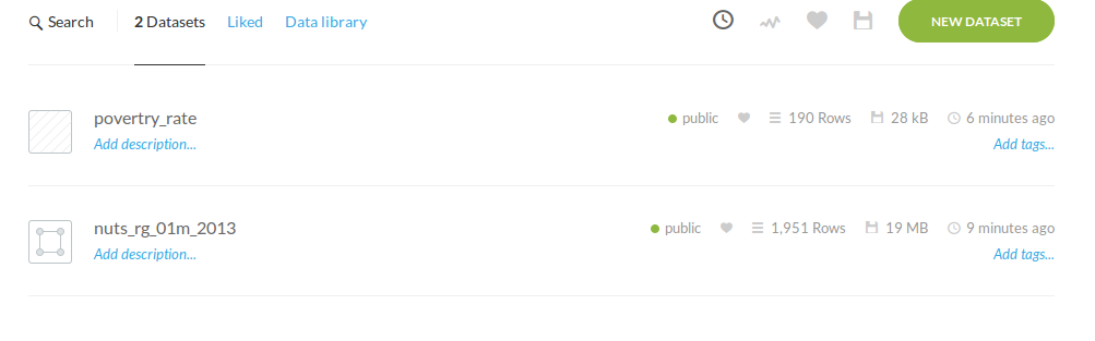
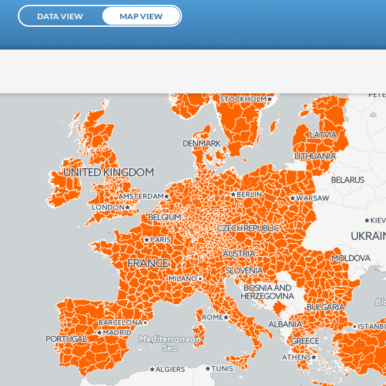
If you open the nuts_rg_01m_2013 dataset, you will get a table with all the shapefile fields. If you choose the MAP VIEW option, you can get a first view of the Shapefile:
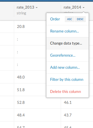
Open now the povertry_rate dataset. There is a thing to do here. By default, the fields are all strings, and we want the povertry rates to be floats, since then CartoDB can order and color the values. This image shoes how to do it. We will use the rate_2013 field, since its the one that will match the NUTS file from 2013 and has all the data (unlike the 2014):
Merging the datasets
There are two options to join both tables. The first one is to use the merge datasets button:
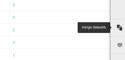
It’s maybe an easiest option, but not very convenient, since it will create a new table with the merged data. If you are using the free CartoDB version, this will make you run out of space very fast. The alternative is creating a good SQL query that joins the two tables dynamically. I’ll explain it in the next section.
Creating the map
Creating a map is very easy. When you select a dataset, there’s a button to do so. But in our case, we want to change the SQL, so we will create an independent map:
Go to your account’s maps section:

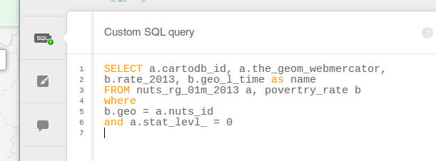
Then, create a new map. At the sql section, paste the following code:
SELECT a.cartodb*id, a.the_geom_webmercator,
b.rate_2013, b.geo_l_time as name
FROM nuts_rg_01m_2013 a, povertry_rate b
WHERE
b.geo = a.nuts_id
AND a.stat_levl* = 0
- Note that the SELECT is a regular PosgreSQL/PostGIS query
- At the FROM part of the query I’ve selected the two datasets
- a.cartodb_id is necessary to make queries over the map (onclick and onmouseover)
- a.the_geom_webmercator is necessary to get the geometries from the nuts_rg_01m_2013 dataset. When joining two tables, CartoDB needs to know which is the geometry column from the result
- The other selected fields are the name and the povertry rate, necessary to put colors and create the onclick queries
- The WHERE section joins both tables and selects only the countries (NUTS0, stored at the statlevl field)
Formatting the map
Now, we only have to format the map a little. The first thing, let’s create a choropleth map. Just put the settings as in the following image:
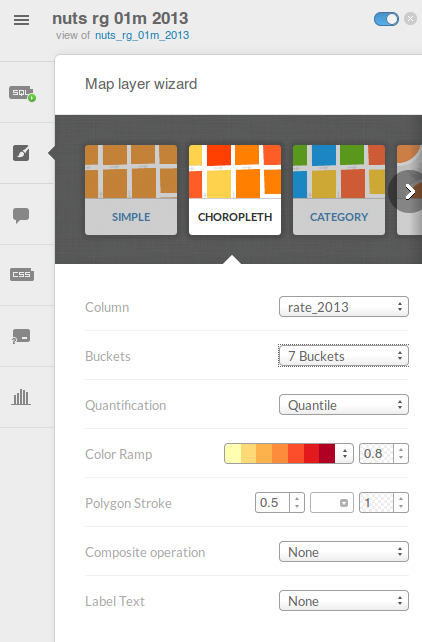
This will color the map, but with the intervals set automatically. It’s a nice start, but the intervals aren’t the best ones. To change it, just change the css section:
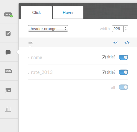
You can change the scale at the scale section under the css section. Finally, activate the onclick behaviour:
The result
At the top right corner, you can find how to publish the new map. Here you have the result:
Once done the first time, creating new maps is really easy. I’m impressed with it!
Links