Canvas mapping with a retina display
Using D3js with canvas is great for mapping, sice the performance you get in the client’s browser is really better than using SVG. This is because the browser doesn’t have to put in the DOM all the drawn elements, which in a map are usually not important (the background map, for instance). An example of this can be seen in this example with dynamic projection.
Also, a raster map can be created, as in this other example. Or even faster styling as in the chalkboard map example.
The problem in using canvas is the retina display devices, like the IPhone. We’ll see how to manage this case in this post.
Blurry edges
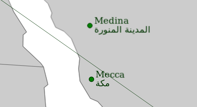
The image below shows the problem when drawing canvas with a retina display:
 When setting up a canvas element, the numebr of actual pixels in a retina display is 4 times the declared in the canvas. That’s why the computer interpolates the drawing and gets the blur effect.
You can see the example in the image here. If you don’t have a retina display device, all the parts of the map will look ok. Take a look at the section below to simulate the retina display.
The way to solve it is pretty simple, just add:
if (window.devicePixelRatio){
canvas
.attr('width', width _ window.devicePixelRatio)
.attr('height', height _ window.devicePixelRatio)
.style('width', width + 'px')
.style('height', height + 'px');

    context.scale(window.devicePixelRatio, window.devicePixelRatio);

}
- window.devicePixelRatio is the property you can use to detect the retina display. The value is 1 (or -1) in regular devices and 2 in the retina displays
- The canvas is made two times bigger in each dimension, so the number of pixels will be the good one
- The canvas element is restyled to have the same dimensions we had at the begining, to it will look the same (but with more pixel density)
- The context is scaled so when an element is drawn, the final size is two times bigger, as our canvas
What if I don’t have any retina display device?
I don’t have it neither! Fortunately, firefox allows a way to simulate it:
- Open the address: about:config and say that you really want to change stuff there
- Search the layout.css.devPixelsPerPx property, which will be -1.0 by default
- Change it to 2 Everything in the browser will look four times bigger, and when reloading the example, you will see the differences between having set properly or not the pixel ratio.
Links
- Example 1: Proper way to make a simple map with retina
- Example 2: Comparing the proper and the wrong way
- Retina canvas example
- Stack Overflow question about the topic
- Proper value in Firefox to change the resolution
- Source of the image used for this post