Mapping EUROSTAT data with D3js
Eurostat gives a lot of statistical data, most of the times georeferred. This makes easy to create nive maps telling stories about any topic you may be interested in.
Unfortunately, I didn’t find an easy way to do that using D3js, so I wrote a post some time ago on how to do it. The idea worked, but I think that it can be done really easily, without python scripts, just by downloading Excel sheets and exporting to CSV. Also, with the new d3-composite-projections version, a convenient projection has been added to show the island and terrotories away from Europe, but that appear at the Eurostat data.
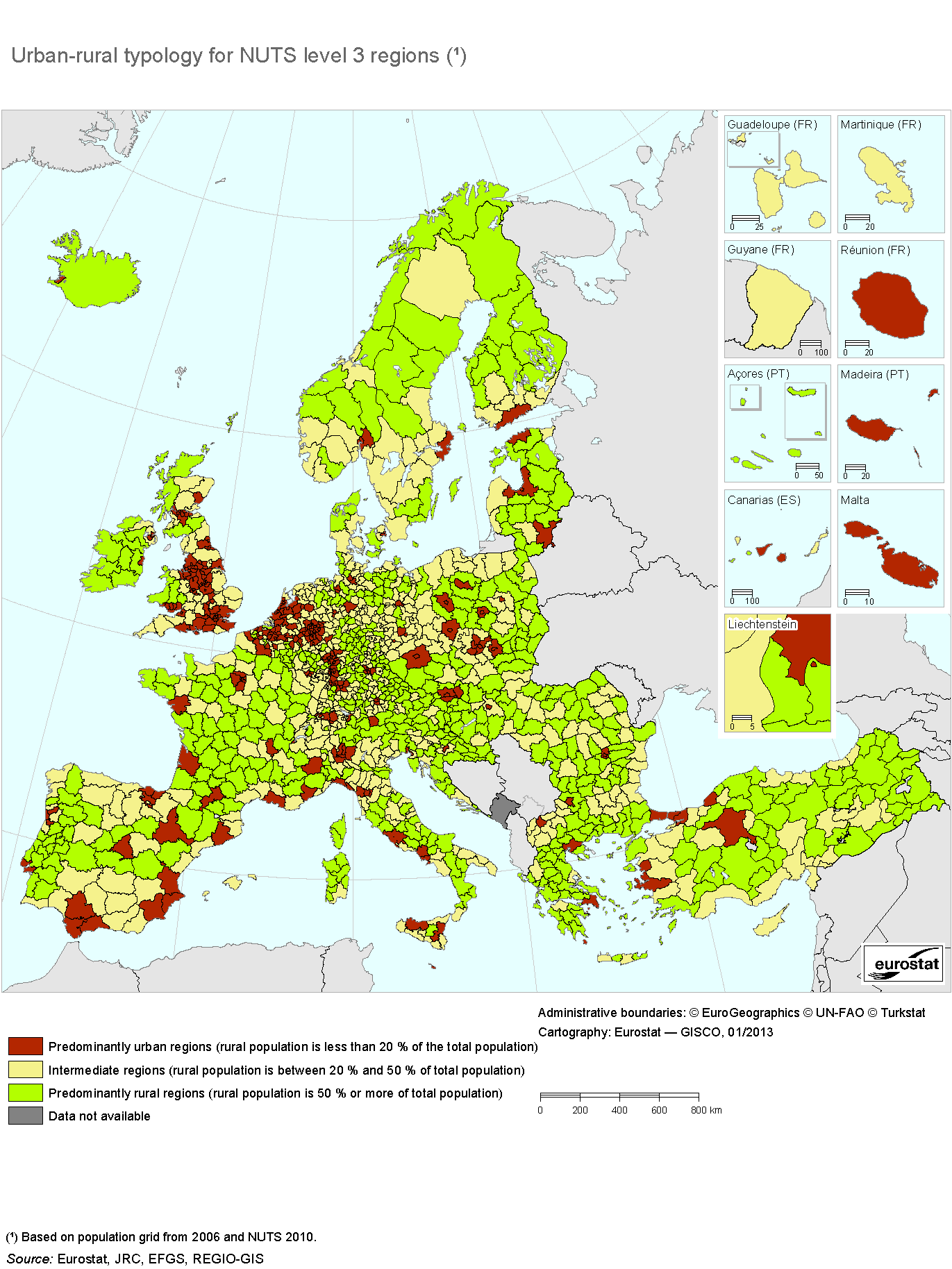
The idea is creating the maps as Eurostat does:
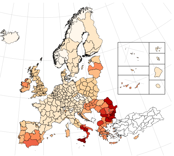
You can see the working example at bl.ocks.org, and it looks like this:
Downloading some sample data
To create a map, you will need two data sources:
- The regions where the data belongs. The regions are coded in a system called NUTS (Nomenclature of territorial units for statistics)
- The data you want to represent at each region, such as Greenhouse gas emisions, murders, etc
NUTS regions
Getting the regions and using them in TopoJSON format is not very straigth forward, so I did it for you.
The files are at [this gist][https://gist.github.com/rveciana/5919944], with the names nuts0.json, nuts1.json, etc. You can use rawgit to get the files without downloading them. To get the nuts3 topojson:
https://cdn.rawgit.com/rveciana/5919944/raw/19dc3e37a6ca5ebb05d3a2d96a1f499d6cc3411c/nuts3.jsonIf you want to know how to generate these TopoJSONs, you can check the next post
Getting the information data
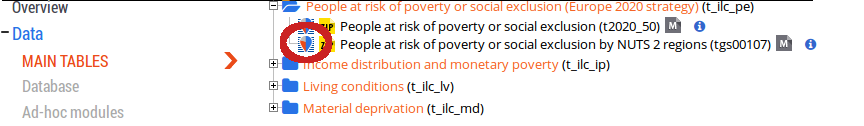
To get the data, you have first to decide which data to use. In my case, I have chosen to map the amount of people at risk of poverty or social exclusion. To do it, from the main page, I have done:
Population and Social conditions -> Income and living conditions -> Main Tables -> People at risk of poverty or social exclusion by NUTS 2 regions.
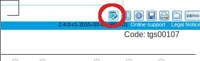
From there, choose Tables, maps and graphs interface:
Choose the More data in the source dataset button:
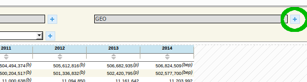
Then, the GEO + button:
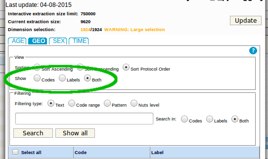
Once there, ask to get not just the region names, but the labels too, so the topoJSON codes can be used. Don’t forget to click the update button:
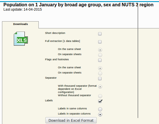
Now you can click the download button and ask to have the labels in a separate column from the name (or doing it yourself will be a mess, believe me):
Oce the excel file is generated, export it to CSV. In our case, two tables are generated. I have chosen the first one percentage of total population, and remove the other parts.
Why not generating CSV files directly if there is an option? Because it will generate a row for each year and region, making things much more difficult.
Creating the map
To create the map, I’ve done it as usual, but loading a the csv with the variable data. This way, just by changing the csv, creating new maps is very easy. The working example is at bl.ocks.org.
Some things deserve a little explanation.
Creating the color scale:
var scale = d3.scale.quantize().domain([10, 60]).range(colorbrewer.OrRd[9]);I have used the colorbrewer2 library, which gives many color scales already made. You just have to choose how many colors to use (9 in the example) and the scale name (OrRd). Choosing one is really simple. Just go to the library page and play with the examples until you have the codes.
The domain indicates the maximum and minumum values for the scale. Since no country has values lower than 10 or higher than 60, I forced these limits.
Choosing the color to paint the region:
.style("fill",function(d){
var value = data[d.id];
if (isNaN(value)){
value = data[d.id.substring(0,2)];
}
if (isNaN(value)){
return "#fff";
}

      return scale(value);
      })
I took this data because it’s not perfect. Some data is given by NUTS2 and other by NUTS1. This is, some is given by country and other by quite large regions.
- data has all the csv data as a structure. When choosing the key d.id, the data for the current region should be used.
- The regions with NUTS1 data won’t work, since the code is for the whole country, not for the region. Fortunately, the NUTS2 codes include the NUTS1 code. This is UK12 belongs to UK. Thats why I used the conditional. If no value is found, we try with the first two characters, and the NUTS1 code may match then.
- In some cases, the region is not found, since it’s not in the CSV file. A white color is then returned.
To show a small tooltip, a similar solution is used.
The whole code, running at bl.ocks.org is this one:
<!DOCTYPE html>
<meta charset="utf-8">
<style>

.border {
stroke: #000;
fill: none;

}
.graticule {
fill: none;
stroke: #777;
stroke-width: .5px;
stroke-opacity: .5;
}

div.tooltip {
position: absolute;
text-align: center;
width: 84px;
height: 64px;
padding: 2px;
font: 12px sans-serif;
background: lightgrey;
border: 0px;
border-radius: 8px;
pointer-events: none;
}
</style>

<body>
<h1>People at risk of poverty or social exclusion by NUTS 2 regions</h1>
<script src="http://d3js.org/d3.v3.min.js"></script>
<script src="http://d3js.org/topojson.v1.min.js"></script>
<script src="http://d3js.org/colorbrewer.v1.min.js"></script>
<script src="https://cdn.rawgit.com/rveciana/d3-composite-projections/v0.2.0/composite-projections.min.js"></script>
<script>

var div = d3.select("body").append("div")
.attr("class", "tooltip")
.style("opacity", 0);

var width = 600,
height = 500;

var projection = d3.geo.conicConformalEurope();
var graticule = d3.geo.graticule();

var path = d3.geo.path()
.projection(projection);

var scale = d3.scale.quantize().domain([10,60]).range(colorbrewer.OrRd[9]);
var svg = d3.select("body").append("svg")
.attr("width", width)
.attr("height", height);

    svg.append("path")
        .datum(graticule)
        .attr("class", "graticule")
        .attr("d", path);

d3.json("https://cdn.rawgit.com/rveciana/5919944/raw//nuts2.json", function(error, europe) {
d3.csv("povertry_rate.csv", function(error, povrate) {
var land = topojson.feature(europe, europe.objects.nuts2);

    data = {};
    povrate.forEach(function(d) {
      data[d.GEO] = d['2013'];
    });

    console.info(data);
    svg.selectAll("path")
      .data(land.features)
      .enter()
      .append("path")
      .attr("d", path)
      .style("stroke","#000")
      .style("stroke-width",".5px")
      .style("fill",function(d){
            var value = data[d.id];
            if (isNaN(value)){
              value = data[d.id.substring(0,2)];
            }
            if (isNaN(value)){
              return "#fff";
            }

            return scale(value);
            })
      .on("mouseover", function(d,i) {
            var value = data[d.id];
            if (isNaN(value)){
              value = data[d.id.substring(0,2)];
            }
            div.transition()
                .duration(200)
                .style("opacity", 0.9);
            div.html("<b>"+d.properties.name+"</b><br/>" + value + "%")
                .style("left", (d3.event.pageX) + "px")
                .style("top", (d3.event.pageY - 28) + "px");
        })
      .on("mouseout", function(d,i) {
          div.transition()
              .duration(500)
              .style("opacity", 0);
        });

        svg
          .append("path")
            .style("fill","none")
            .style("stroke","#000")
            .attr("d", projection.getCompositionBorders());

});
});

</script>